


How to Optimize Landing Pages for Explosive Conversion Rates

Before you even think about A/B testing a button color or tweaking a headline, let's get one thing straight: a high-converting landing page is built on a rock-solid foundation. It’s a strategic tool with a single, obsessive focus.
You have to get the core strategy right before you write a single line of copy or pick a stock photo. A winning page is a focused, persuasive experience, not just a random collection of elements.
Building the Foundation for a High-Converting Landing Page
The first step is adopting a conversion-centric mindset. Every landing page has exactly one job: to convince a visitor to take one specific action. That's it. This laser focus is what separates a page that drives sales and fills your pipeline from one that just sits there collecting dust.
This isn't industry-specific, either. A B2B SaaS company wants you to book a demo. A local plumber needs you to call for an emergency repair. An e-commerce brand is pushing for that "Add to Cart" click. The goal is always singular, clear, and immediate.
Understanding the Conversion Landscape
So, what does "good" even look like? To know if your efforts are paying off, you need a baseline. Industry benchmarks give you a crucial starting point for setting realistic goals.
A massive analysis of over 41,000 landing pages found that the median conversion rate is 6.6%. But here's where it gets interesting: the top performers are hitting 11% or more. They’re essentially tripling the results of the average page.
The data also shows that volume matters. Businesses with 31-40 landing pages generate a staggering seven times more leads than those with just one to five. The opportunity for growth through strategic optimization is massive.
This whole process boils down to three key stages: getting the foundation right, nailing the design, and then writing killer copy.
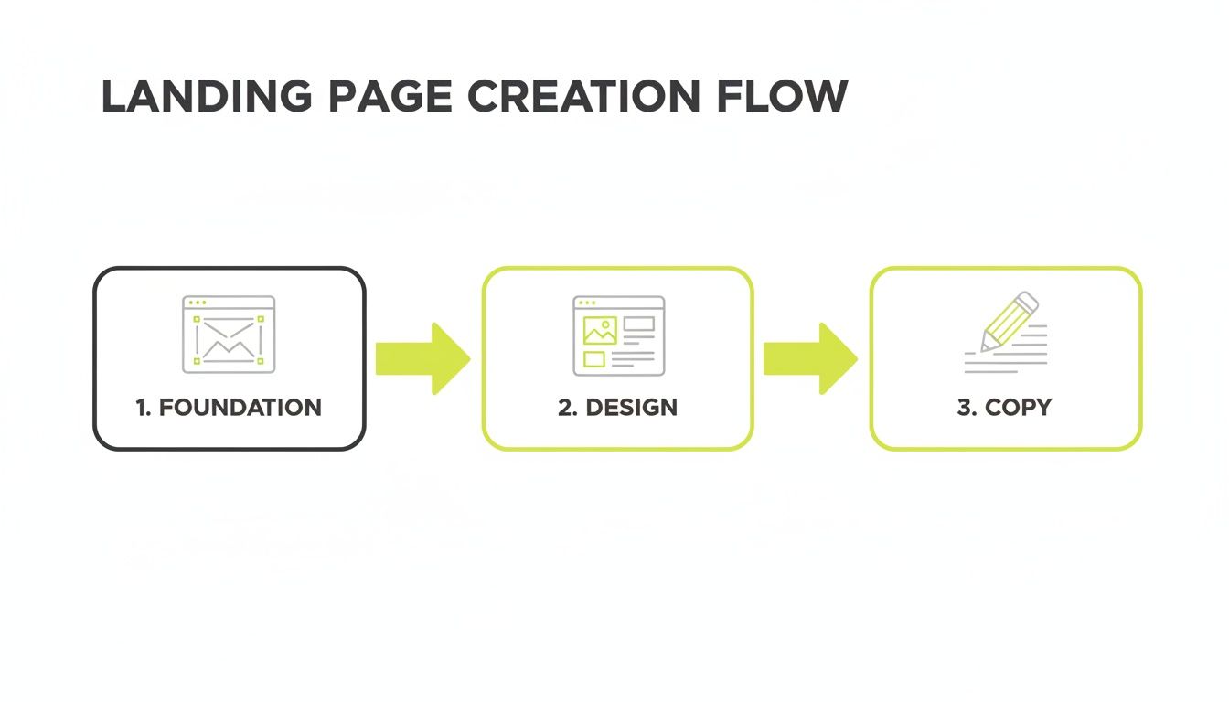
As the flow shows, a landing page that converts isn't an accident. It's the direct result of a deliberate process where strategy, user experience, and messaging all work together.
The Core Principle: One Page, One Goal
This is the most common mistake I see businesses make, and it’s a killer. They clutter their landing pages with multiple offers, navigation links to their main site, and competing calls-to-action. This creates decision paralysis, and confused visitors don't convert.
The rule is simple yet incredibly powerful: one page, one purpose. Every single element—the headline, the images, the social proof, the CTA—must support that single conversion goal. Anything that distracts from it needs to be ruthlessly cut.
Think of your landing page as a focused sales conversation. You wouldn't try to sell a customer three different things in the same breath. Your page needs that same unwavering focus. For example, a landing page for a webinar should only be about signing up for that webinar. Don't include links to your blog, services, or a "contact us" page in the main navigation. The only way out should be through the sign-up button or by closing the tab.
Defining Your Audience and Offer
A page that speaks to everyone speaks to no one. To create a high-converting landing page, you have to know exactly who you're talking to and what deep-seated problem you're solving for them. This is where creating detailed buyer personas is non-negotiable. If you need a primer on this, our guide on how to create buyer personas breaks it down step-by-step.
Once you know your audience inside and out, you can craft an offer so compelling it feels like a no-brainer. Your offer is the heart of your value proposition—it’s the reason they should act right now.
Here’s how this audience-offer alignment looks in the real world:
- For an E-commerce Brand: The audience is a first-time visitor curious about sustainable fashion. The offer? "Get 15% Off Your First Order of eco-friendly apparel." The page would lean heavily into the brand's commitment to sustainability.
- For a Local Service Business: The audience is a stressed-out homeowner with a burst pipe. The offer is "Schedule a Free, No-Obligation Estimate Today." The page would scream speed, reliability, and trust.
- For a B2B SaaS Company: The audience is a marketing manager drowning in unqualified leads. The offer is a "Live 15-Minute Demo to see how our software automates lead scoring." The page would focus on efficiency, ROI, and making their life easier.
Nailing this foundation—understanding the benchmarks, committing to a single goal, and tightly aligning your audience with a powerful offer—sets the stage for everything else. Get this right, and your optimization efforts will be infinitely more successful from the get-go.
Core Elements of a High-Performing Landing Page
To help you visualize this foundation, here’s a quick-reference table breaking down the essential components every landing page needs. Think of these as the non-negotiable building blocks for conversion.
| Element | Purpose | Best Practice Example |
|---|---|---|
| Compelling Headline | Grab attention and communicate the core value proposition in under 5 seconds. | "The Accounting Software That Makes Tax Season Effortless." |
| Clear Subheading | Elaborate on the headline and provide additional context or a key benefit. | "Join 50,000+ small businesses who save an average of 40 hours per month." |
| Hero Image/Video | Visually communicate the offer's value and help the visitor picture success. | A short video showing a smiling business owner easily navigating the software. |
| Benefit-Oriented Copy | Focus on what the user gains (the "why"), not just product features (the "what"). | Instead of "Advanced reporting," use "Make smarter decisions with instant insights." |
| Social Proof | Build trust and credibility using testimonials, case studies, or logos. | "This tool cut our reporting time in half!" – Jane Doe, CEO of Acme Inc. |
| Single, Clear CTA | Tell the visitor exactly what to do next with an action-oriented command. | "Start Your Free 14-Day Trial Now" (not "Submit" or "Learn More"). |
| Minimalist Form | Only ask for the information you absolutely need to reduce friction. | Just an email field for a newsletter signup; Name and Email for a demo. |
By ensuring each of these elements is present and optimized to support your single conversion goal, you're building a page designed for success from the ground up.
Designing for Persuasion and a Frictionless Experience
Once you've poured the concrete for your landing page's foundation, it's time to build the structure. This is where design comes in. But let's get one thing straight: effective landing page design has nothing to do with winning art awards. It's a strategic exercise in psychology and user guidance, all crafted to make your desired action feel like the most natural, obvious next step for the visitor.
Your one and only goal here is to create a frictionless experience that directs attention, builds trust, and ruthlessly eliminates distractions. The visitor should feel like they're being gently guided by the hand, not thrown into a maze. Every single element must work in harmony to persuade them that your offer is the solution they need, right now.
Create a Focused User Journey
The single most powerful design choice you can make is to create a closed loop. Think of your landing page as a room with only one door—the one leading to your conversion goal. This means you have to be absolutely brutal about removing any exit points that don't serve that specific purpose.
The biggest offender? Your main navigation menu. Distractions are conversion killers, and I’ve seen firsthand how removing navigation can boost rates by up to 100%. The data backs this up: pages with just one link convert at 13.5%, crushing those with five or more links, which convert at just 10.5%. This simple tweak creates a laser-focused funnel that steers users directly toward your call-to-action (CTA). You can dig into more of these stats over at Marketing LTB's landing page statistics roundup.
By getting rid of links to your "About Us," "Blog," or "Services" pages, you stop visitors from wandering off before you've had a chance to make your case. The spotlight has to stay on the offer at hand.
Establish a Clear Visual Hierarchy
Visual hierarchy is simply the art of arranging elements to show their order of importance. It’s how you take control of where a user's eyes go first, second, and third. Get this right, and your page becomes instantly scannable, pulling their attention straight to your CTA.
Here’s how to build a hierarchy that actually works:
- Size and Scale: Your headline needs to be the biggest text element on the page. It has to grab them immediately. Your CTA button should also be prominent, using its size to signal just how important it is.
- Color and Contrast: Use a bright, contrasting color for your CTA button so it pops right off the background. If your brand palette is mostly blues and grays, a vibrant orange or green button will practically scream "click me."
- Whitespace: Don't cram your elements together. Being generous with negative space around key items, like your form and CTA, makes them stand out and feel much less intimidating.
Think about a newspaper. The biggest story always gets the biggest headline. Your landing page should follow the exact same logic, with your value proposition and CTA as the front-page news.
A great landing page doesn't make the user think. It anticipates their questions and visually guides them from the headline to the button click with zero confusion. This seamless flow is the hallmark of a frictionless experience.
Build Trust with Visual Cues
People buy from people they trust. Since you can't be there to shake their hand, you have to lean on visual elements to create an instant sense of credibility and connection. This is where you bring in the heavy hitters: authentic imagery and social proof.
Using images of real people is a potent way to forge an emotional connection. Eye-tracking studies consistently show that our brains are hardwired to look at human faces.
- A local real estate agent could feature a high-quality photo of a happy family standing in front of their new home. This isn't just a picture; it's helping the visitor visualize their own dream outcome.
- A B2B tech firm could show a picture of their friendly, smiling support team, making the entire company feel more approachable and human.
This human element works perfectly alongside social proof. Placing logos of well-known clients "above the fold" lets you immediately borrow their authority. And testimonials paired with a photo of the actual person are infinitely more believable than some anonymous quote.
Combine these elements for maximum impact. A punchy headline, a compelling hero image featuring a person, a row of trust-building client logos, and a high-contrast CTA button all working together—that's how you create a persuasive, frictionless path that turns curious visitors into leads or customers.
Writing Compelling Copy That Drives Action
If your design is the road, your words are the signs telling visitors exactly where to go. Landing page copy is your hardest-working salesperson, pulling a 24/7 shift to turn idle curiosity into decisive action. Forget fancy jargon; great copy is all about clarity, empathy, and making a direct connection with your visitor’s biggest headaches.
Think about it from their perspective. Someone lands on your page wrestling with a specific problem. Your words need to instantly reassure them they’re in the right place and that you have the precise solution they've been searching for. Every sentence has one job: build momentum toward that final click.
Crafting a Headline That Hooks
You get maybe five seconds, tops. Your headline is the single most important string of words on the page. Its sole purpose is to scream your core value and give the reader a compelling reason to scroll down instead of hitting the back button.
A powerful headline never talks about what your product is. It’s all about what your product does for the customer. Focus on the benefit, the dream outcome, or the pain point you obliterate.
Here’s the simple shift from features to benefits in action:
- Weak (Feature-focused): "Our Advanced SEO Reporting Software"
- Strong (Benefit-focused): "Stop Guessing. See Exactly Which Keywords Drive Your Sales."
That second one? It speaks directly to a business owner's frustration and promises a tangible, valuable result. It’s an instant hook that pulls them deeper into the page.
Writing Scannable Body Copy
Let's be real: nobody reads a landing page like it's a novel. They scan. They’re hunting for keywords, headings, and bullet points that jump out and scream, "This is what you're looking for!" Your job is to make your key messages impossible to miss.
Chop up your text into short, digestible paragraphs—two or three sentences, max. Use bold text strategically to highlight the most critical benefits, guiding the reader’s eye down the page like a trail of breadcrumbs.
Your body copy should feel like a one-on-one conversation. Acknowledge their pain, show you understand it, and then cleanly present your offer as the most obvious and effective solution to that pain.
Instead of drowning them in a wall of text, use bullet points to break down your benefits. This format makes complex info easy to absorb and helps visitors quickly tick the boxes in their mind, confirming your offer is a perfect match.
Practical Example: A Personal Trainer's Landing Page
- Instead of this: "Our training program includes customized workout plans, nutritional guidance, and weekly check-ins to help you reach your goals."
- Use this:
- Lose Stubborn Fat with a workout plan built for your body type.
- Stop Dieting Forever with simple, sustainable nutrition coaching.
- Stay Motivated with weekly accountability from a dedicated expert.
The second version uses punchy, active language and is laser-focused on the results everyone wants. The value is undeniable.
Transforming Your CTA Into an Action Command
Your call-to-action (CTA) is the finish line. Don't trip at the last second with weak, passive words like "Submit," "Download," or "Click Here." These are conversion killers because they offer zero value. A truly great CTA is an action-oriented command that finishes the sentence, "I want to…"
Get specific with your button text. The user should know exactly what’s going to happen when they click. That clarity strips away friction and builds the confidence they need to convert.
Let's look at some simple but powerful CTA makeovers:
| Before (Passive & Vague) | After (Action-Oriented & Specific) | Context |
|---|---|---|
| Submit | Claim My Free 15-Minute Strategy Call | For a marketing consultant |
| Download | Get My Free E-Commerce Cheatsheet | For a digital product |
| Sign Up | Start My 14-Day Free Trial | For a SaaS product |
| Order Now | Get 20% Off My First Order | For an online store |
The "After" examples are far more enticing because they spell out the immediate value the user gets. They create a sense of ownership ("My Free…") and excitement. This small wording tweak is a fundamental part of learning how to optimize landing pages for real impact, turning a polite suggestion into an irresistible next step.
Mastering Technical Health for Speed and Visibility
You can have the most beautiful design and persuasive copy in the world, but if your landing page is slow, broken on mobile, or invisible to Google, none of it matters. The technical health of your page is the invisible engine driving conversions. If you neglect it, even the most brilliant campaign will stall out before it ever gets going.
These technical tune-ups aren't just nice-to-haves; they're non-negotiable for a smooth user experience, which is what ultimately impacts your bottom line. Let's dig into the essential optimizations that support every other effort you're making.
Prioritizing Blazing-Fast Page Speed
Every single second counts. Seriously. A mere one-second delay in page load time can slash your conversion rate by a staggering 7%. For a page built to capture leads or drive sales, that delay is a self-inflicted wound that just bleeds revenue.
Fast-loading pages feel professional and trustworthy. Slow pages just create frustration and doubt, leading to a quick click of the "back" button. If you're seeing high bounce rates, page speed is one of the first culprits to investigate. A snappy experience is your first line of defense against impatient visitors.
Here's a practical checklist to get your speed up:
- Compress Your Images: This is the big one. Large image files are the most common speed killer I see. Use tools like TinyPNG or ImageOptim to drastically shrink file sizes without sacrificing quality. A stunning hero shot shouldn't cost you customers.
- Leverage Browser Caching: Set up caching so a visitor’s browser can store parts of your page. The next time they visit, the page loads almost instantly because their browser doesn't have to re-download every single thing.
- Minimize Code (CSS & JavaScript): Cluttered or bloated code can really bog down your page. "Minification" tools strip out all the extra spaces and characters from your code files, making them lighter and faster for browsers to process.
Adopting a True Mobile-First Experience
In this day and age, "responsive design" is just table stakes. You have to go a step further and design for a true mobile-first experience. Think about it: over 63% of consumers are using their phones to research products and services. If your landing page is just a clunky, scaled-down version of your desktop site, you're alienating the majority of your audience right out of the gate.
A mobile-first approach forces you to design for the smallest screen first and then scale up. It’s a creative constraint that makes you prioritize what truly matters.
The mobile experience isn't just about how your page looks; it's about how it works. Can a user easily tap a button with their thumb? Can they fill out a form without pinching and zooming? Friction on mobile is a conversion death sentence.
Imagine a local plumbing business. A potential customer searching for an "emergency plumber" on their phone needs to see a huge, tappable phone number or a simple "Request Service" button immediately. They are not going to wrestle with a tiny, complex form while their basement is flooding.
Optimizing for Organic Search Visibility
While many landing pages are built specifically for paid campaigns, sprinkling in some basic on-page SEO can turn that page into an asset that captures valuable organic traffic over time. This means you can attract highly qualified visitors without paying for every single click. It's just a smart, fundamental part of optimizing your landing pages for long-term success.
Focus on these core on-page SEO elements:
- Title Tag: This is the headline that shows up in Google search results. Make it compelling and include your primary keyword. Something like, "Best Yoga for Beginners in Austin | Claim Your Free Intro Class."
- Meta Description: This is the little snippet of text under the title tag. It's your 160-character ad to convince someone to click, so make it benefit-driven.
- URL Structure: Keep your URL clean, short, and descriptive. A URL like
yourbrand.com/free-yoga-classis infinitely better for users and search engines thanyourbrand.com/page-id-12345.
And it doesn't stop with traditional SEO. It's also worth understanding how content is being ranked in new AI-powered search environments. If you want to go deeper, check out this resource on ChatGPT ranking factors. Mastering these technical details ensures your page is fast for users and clear for search engines—a powerful combination for any conversion goal.
Using Data to Systematically Boost Your Conversions
Intuition has its place in business, but when it comes to landing page optimization, data is the only boss. Guesswork is a fast track to wasted time and missed opportunities. What really separates the pages that just sit there from the ones that consistently crush their goals is a systematic, data-driven approach.
This isn't about hoping for conversions; it's about engineering them. By methodically testing specific elements and personalizing the user experience, you can transform a static page into a dynamic asset that actively works to turn visitors into customers.
Demystifying A/B Testing for High Impact
A/B testing, also known as split testing, is the bread and butter of conversion rate optimization. The idea is wonderfully simple: you create two versions of your page (an 'A' version and a 'B' version), show each to a different slice of your audience, and let the numbers tell you which one performs better for your specific goal.
This process brutally eliminates subjectivity. It doesn't matter which headline you think sounds better. The only thing that matters is which one actually gets more clicks, sign-ups, or sales.
To get started, focus on the big swings—the high-impact elements that can deliver significant wins right out of the gate. Don't get bogged down testing tiny changes in font size or obscure button colors. Go for the jugular first.
Here are a few powerful A/B testing ideas to get you started:
- Headlines: Test a benefit-driven headline ("Accounting Software for Busy Founders") against one that agitates a major pain point ("Stop Drowning in Receipts and Invoices").
- Hero Images: Pit a clean product shot against a lifestyle photo showing a happy customer. Does your audience connect more with the tool itself or the result it delivers?
- CTA Button Copy: Try a standard call-to-action like "Get Started" against a value-focused one like "Claim My Free Audit." More often than not, specificity wins.
The golden rule of A/B testing is to only test one variable at a time. If you change the headline, the hero image, and the button color all at once, you’ll have no idea which change was actually responsible for the lift (or drop) in conversions.
To help you prioritize your efforts, here is a matrix of A/B testing ideas organized by their potential impact on your conversion rates.
A/B Testing Idea Matrix for Landing Pages
| Element to Test | Variation Idea 1 | Variation Idea 2 | Potential Impact |
|---|---|---|---|
| Headline | Benefit-Oriented (e.g., "Save 10 Hours a Week") | Pain-Point Agitation (e.g., "Tired of Wasting Time?") | High |
| Call-to-Action (CTA) Button | "Get Your Free Trial" | "Start Building Now" | High |
| Hero Image/Video | Product in Action (Video) | Customer Testimonial (Image) | High |
| Offer | 14-Day Free Trial | 20% Off First Month | High |
| Page Layout | Single-Column Layout | Two-Column with Sidebar | Medium |
| Social Proof | Customer Logos | Written Testimonials with Photos | Medium |
| Form Fields | 3 Fields (Name, Email, Company) | 2 Fields (Name, Email) | Medium |
| Button Color | High-Contrast (e.g., Orange on Blue) | Brand-Aligned (e.g., Dark Blue on Light Blue) | Low |
This matrix should give you a solid starting point for brainstorming tests that can move the needle without requiring a complete page overhaul.
Avoiding Common Testing Pitfalls
Just launching two variations isn't enough. You have to make sure your results are clean, trustworthy, and actionable. A classic mistake is calling a test too early, long before you’ve reached statistical significance. This is the metric that tells you whether your results are due to the changes you made or just random luck.
Most testing tools calculate this for you, but you should always aim for a 95% confidence level or higher. This means you can be 95% certain the winning version is actually better. Ending a test after just a dozen conversions is a recipe for making bad decisions based on faulty data.
Another critical error is not running the test long enough to account for weekly fluctuations in user behavior. For example, B2B traffic often converts better on weekdays, while e-commerce sales might spike over the weekend. Letting a test run for a full business cycle—usually one to two weeks—gives you a much more accurate picture of performance. To get the most out of your campaigns, think about how an effective approach to ecommerce marketing automation can help you scale these conversion efforts.
The Power of Personalization and Dynamic Content
While A/B testing helps you find the best page for the "average" user, personalization is where you can unlock explosive gains by tailoring the experience to specific segments. This isn't just marketing fluff; the data is compelling. Personalized CTAs convert 202% better than generic ones.
Dynamic content lets you show different headlines, images, or offers to different people based on where they came from, their past behavior, or their demographic info. This turns your page from a static brochure into a live, one-on-one conversation.
Imagine these real-world scenarios:
- Source-Based Personalization: A visitor clicks through from a LinkedIn ad about "lead generation." They land on a page with the headline, "The Easiest Way to Generate B2B Leads." Meanwhile, someone from a Google ad for "CRM for small business" sees "The #1 CRM for Small Business Growth." The message perfectly matches their intent.
- Behavior-Based Personalization: A first-time visitor sees your standard "14-Day Free Trial" offer. But a returning visitor who didn't sign up last time is shown a different offer: "Get 20% Off Your First Three Months." This acknowledges their previous interest and sweetens the pot.
By putting these data-driven strategies into practice, you create a powerful feedback loop: test, learn, personalize, and repeat. This is the very core of building a high-performing landing page and one of the most effective sales funnel optimization strategies you can implement.
Common Landing Page Questions Answered
Even with a solid playbook, you’re going to run into specific questions when you're deep in the weeds of landing page optimization. It happens to everyone. Let's tackle some of the most common ones I hear from clients to clear up the confusion and get you moving again.
How Many Landing Pages Should My Business Have?
There's no single magic number, but the data is crystal clear: more is definitely better. In fact, businesses running 31 to 40 landing pages generate a staggering seven times more leads than companies with just one to five. Think about that for a second.
The goal isn't just to have more pages for the sake of it. It’s about creating a dedicated, hyper-relevant page for each specific marketing campaign, ad group, or audience segment you're chasing.
A local gym, for instance, shouldn't send everyone to its homepage. They need separate, tailored landing pages for campaigns targeting "yoga classes," "personal training services," and "new member discounts." This approach lets you match the message, visuals, and offer directly to what the visitor wants, and that’s what makes conversion rates jump.
What Is a Good Landing Page Conversion Rate?
This one varies wildly by industry, but a solid benchmark to aim for is the cross-industry median of 6.6%. Top-tier pages, however, often break 11% or more.
But here’s the thing: your primary goal should be continuous improvement, not just hitting some arbitrary number. If your page is converting at 2%, optimizing it to 4% is a massive win. You just doubled your leads from the exact same traffic.
Use industry benchmarks as a North Star, but your real measure of success is consistently beating your own past performance through methodical A/B testing and optimization.
Should I Use a Long or Short Landing Page?
This classic "it depends" question comes down to two things: the complexity of your offer and where your visitor is in their buying journey.
For simple, low-commitment actions like a newsletter signup, a short, punchy page almost always wins. It gets straight to the point without giving the user a reason to overthink it. For example, a page to download a free checklist only needs a headline, one sentence of benefit, and an email form.
On the other hand, for a high-commitment or expensive offer—think enterprise software or a high-ticket coaching program—a long-form page is often essential. You need the extra real estate to build trust, crush objections, detail the benefits, and pile on enough social proof to make the decision feel safe. This page might include a video walkthrough, multiple testimonials, detailed feature breakdowns, and an FAQ section.
My advice? Test it. Start with a concise page. If your numbers are disappointing, test a longer version that adds more detail, testimonials, or even an FAQ section. See if giving visitors more information gives them the confidence they need to take action.
Ready to stop guessing and start building landing pages that turn advertising into revenue? The team at Silver Spoon Agency creates conversion-focused funnels and omnichannel campaigns that deliver measurable growth. Discover how we can elevate your marketing and book your strategy call today.